IMPROVING DISCOVERABILITY
AMAZON'S SHOPBOP
Proper filters significantly improve discovery on a website by helping users quickly narrow down large amounts of content to find exactly what they’re looking for. Instead of scrolling through endless options, users can set preferences — like price range, category, style, or availability — and instantly see relevant results.
THE PROBLEM:
Shopbop's filtering was very limited and made it hard for customers to find what they were looking for. Additionally, there were functionality issues with users having to hit "apply" to see their filtered items.
This solution helped increase sales by 20% and ultimately made discovery easier for the customer.

RESEARCH PHASE 1
For any project, I start with a research phase. In this case, we started with looking into what other companies use for their filter options and did competitive research via UserTesting.com with unmoderated testing.
User 1:
"I want to be able to sort by price"
(this user saw sorting as part of the filtering process)
User 2:
"I want to be able to filter by feature"
(not being able to sort by features meant there was still a lot of items to sort through)
User 3:
"I want the items to update automatically as I made selections"
(this outlined a need for it to be easy to use)
RESEARCH PHASE 2
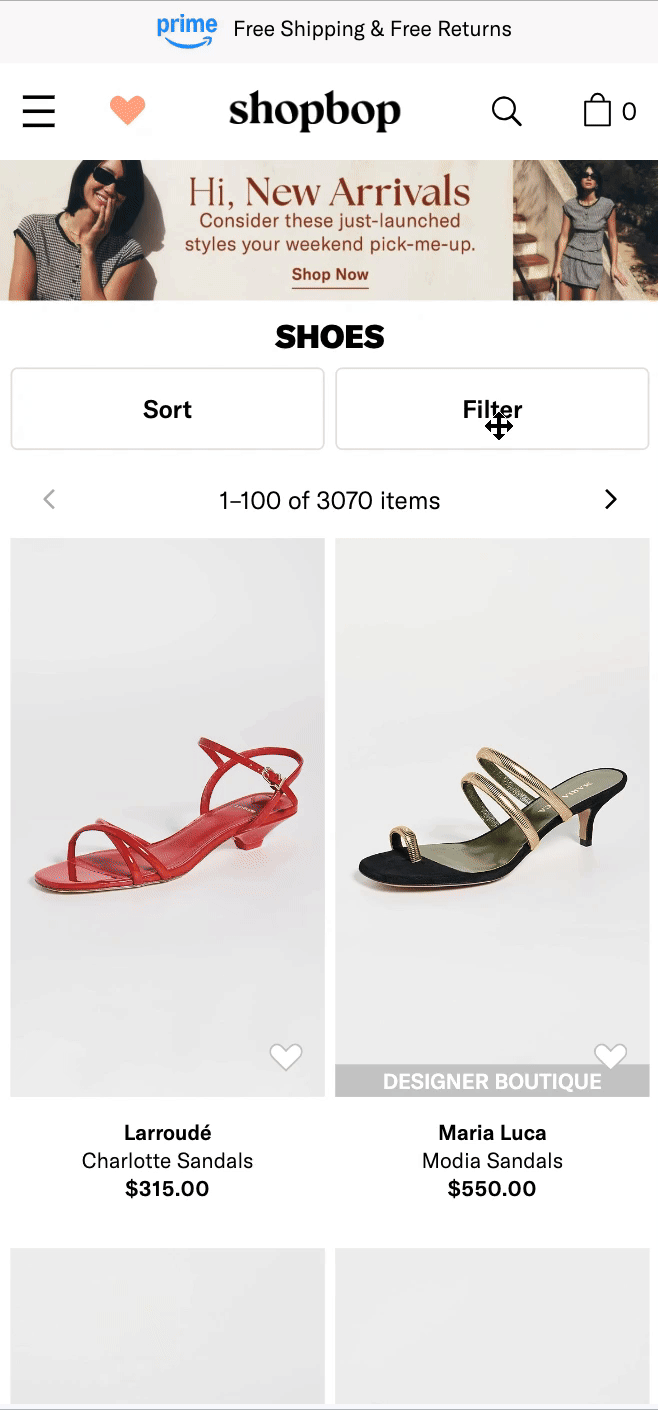
After understanding our goals, we began by enhancing the shoe category with more robust filters and detailed subcategories as a testing ground to validate both the design approach and the filtering logic. This allowed us to observe user behavior in a high-traffic, product-heavy section of the site where discovery is crucial.
We implemented filters for size, color, price range, style, and brand, along with subcategories such as sneakers, boots, flats, and sandals. Our objective was to simplify the process, allowing customers to quickly narrow their search rather than scrolling through hundreds of products.
I designed the interaction for three platforms: app, mobile and desktop
Next Steps:
By prioritizing this category, we conducted usability tests, monitored click-through rates, and analyzed conversion metrics to ensure the filters were intuitive, user-friendly, and aligned with the way customers naturally shop. Based on the data and feedback, we refined the filter hierarchy, language, and UI patterns before extending the design to other categories across the site.


ADDITIONAL LEARNINGS
This project was a great example of how aligning teams around a clear user-centered goal and being willing to do the hard, detailed work can produce impressive results.
FINAL RESULT
These multi-selection filters across all categories, lead to 4% increase in customer engagement, boost in conversion rates, and $9M surge in revenue.
Our Hypothesis is that this increase was due to a better user experience when discovering new products and finding the items customers were looking for as well as due to increased search engine optimization with crawlable keyword linking.